
In the previous section, we learned about events like clicks, custom clicks and different types of rendering, and many more things. Let’s move further in this section covers topics described below with full details and examples.
- Transition and Animation
- Directives
- Routing
1. Transition and Animation
Transition
There are different methods available in VueJS for implementing transitions for HTML elements when they are added/updated in the DOM. Transitions in VueJS are built-in components that need to be wrapped around the elements which require them.
Syntax:

<transition name = "nameoftransition">
   <div></div>
</transition>
As an example, let’s look at how transition works.
Example:
<html>
<head>
<title>VueJs Instance</title>
<script type = "text/javascript" src = "js/vue.js"></script>
</head>
<body>
<style>
.fade-enter-active, .fade-leave-active {
transition: opacity 2s
}
.fade-enter, .fade-leave-to /* .fade-leave-active below version 2.1.8 */ {
opacity: 0
}
</style>
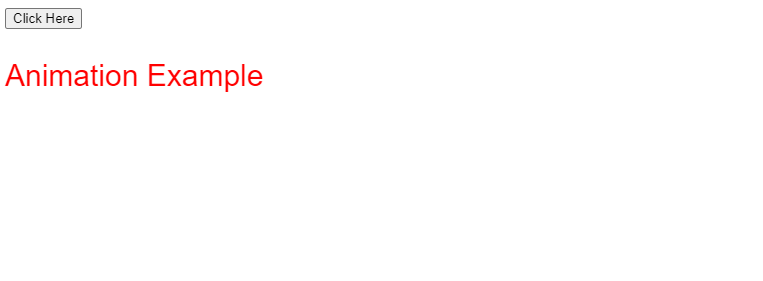
<div id = "databinding">
<button v-on:click = "show = !show">Click Here</button>
<transition name = "fade">
<p v-show = "show" v-bind:style = "styleobj">Animation Example</p>
</transition>
</div>
<script type = "text/javascript">
var vm = new Vue({
el: '#databinding',
data: {
show:true,
styleobj :{
fontSize:'30px',
color:'red'
}
},
methods : {
}
});
</script>
</body>
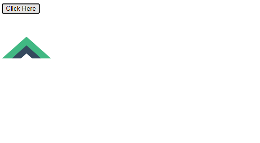
</html>By using the clickhere button, we can change the value of the variable show from true to false and vice versa. In the p tag, the text element only appears if the variable is true. As shown in the following code, we have wrapped the p tag with the transition element.
<transition name = "fade">
   <p v-show = "show" v-bind:style = "styleobj">Animation Example</p>
</transition>
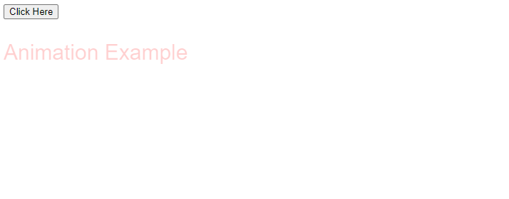
The name of the transition is fade. VueJS provides some standard classes for transitions, which are prefixed with the name of the transition.
Following are some standard classes for transition −
- V-enter — This class is called in the initial situation before updating/adding an element. This is the initial state.
- v-enter-active − Defines the delay, duration, and easing curve for entering the transition phase. During the entire entering phase, the class is in the active state.
- v-leave − Added when the leaving transition is triggered, removed afterwards.
- V-leave-active – Used during the leaving phase. It is removed when the transition is complete. During the leaving phase, this class is used to apply the delay, duration, and easing curve.
The names of each of the above classes will be prefixed with the transition name. Seeing as the transition is fade, the classes are now .fade_enter, .fade_enter_active, .fade_leave, .fade_leave_active.
They are defined in the following code.
<style>
   .fade-enter-active, .fade-leave-active {
      transition: opacity 2s
   }
   .fade-enter, .fade-leave-to /* .fade-leave-active below version 2.1.8 */ {
      opacity: 0
   }
</style>
At the start and at the end of the transition, .fade_enter_active and .fade_leave_active are defined together. After 2 seconds, the opacity is set to 0.
Duration is defined by .fade_enter_active and .fade_leave_active. The final stage is defined by .fade_enter, .fade_leave_to.
The following is the display in the browser.
A click of the button will fade the text in two seconds.
Example:
<html>
<head>
<title>VueJs Instance</title>
<script type = "text/javascript" src = "js/vue.js"></script>
</head>
<body>
<style>
.shiftx-enter-active, .shiftx-leave-active {
transition: all 2s ease-in-out;
}
.shiftx-enter, .shiftx-leave-to /* .fade-leave-active below version 2.1.8 */ {
transform : translateX(100px);
}
</style>
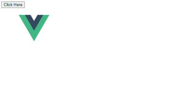
<div id = "databinding">
<button v-on:click = "show = !show">Click Here</button>
<transition name = "shiftx">
<p v-show = "show">
<img src = "images/img.jpg" style = "width:100px;height:100px;" />
</p>
</transition>
</div>
<script type = "text/javascript">
var vm = new Vue({
el: '#databinding',
data: {
show:true
},
methods : {
}
});
</script>
</body>
</html>By using the following code, a transform property is used to shift the image on the x-axis by 100px.<style>
.shiftx-enter-active, .shiftx-leave-active {
transition: all 2s ease-in-out;
}
.shiftx-enter, .shiftx-leave-to /* .fade-leave-active below version 2.1.8 */ {
transform : translateX(100px);
}
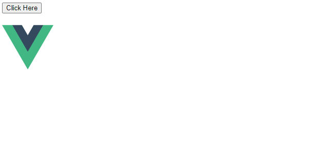
</style>Following is the output.
Clicking the button will cause the image to move 100 pixels to the right, as shown in the following screenshot.
Animation
The effect of animation is the same as that of transitions, but animations also have classes that need to be declared in order to work.
Let’s look at an example to see how animation works.
Example:

<html>
   <head>
      <title>VueJs Instance</title>
      <script type = "text/javascript" src = "js/vue.js"></script>
   </head>
   <body>
      <style>
         .shiftx-enter-active {
            animation: shift-in 2s;
         }
         .shiftx-leave-active {
            animation: shift-in 2s reverse;
         }
         @keyframes shift-in {
            0%   {transform:rotateX(0deg);}
            25%  {transform:rotateX(90deg);}
            50%  {transform:rotateX(120deg);}
            75%  {transform:rotateX(180deg);}
            100% {transform:rotateX(360deg);}
         }
      </style>
      <div id = "databinding">
         <button v-on:click = "show = !show">Click Here</button>
         <transition name = "shiftx">
            <p v-show = "show">
               <img src = "images/img.jpg" style = "width:100px;height:100px;" />
            </p>
         </transition>
      </div>
      <script type = "text/javascript">
         var vm = new Vue({
            el: '#databinding',
            data: {
               show:true
            },
            methods : {
            }
         });
      </script>
   </body>
</html>
As with transitions, there are classes for applying animation. As shown in the following code, there is an image enclosed within a p tag.
<transition name = "shiftx">
   <p v-show = "show"><img src = "images/img.jpg" style = "width:100px;height:100px;" /></p>
</transition>
Shiftx is the name of the transition. It is implemented with the following class: −
<style>
   .shiftx-enter-active {
      animation: shift-in 2s;
   }
   .shiftx-leave-active {
      animation: shift-in 2s reverse;
   }
   @keyframes shift-in {
      0%   {transform:rotateX(0deg);}
      25%  {transform:rotateX(90deg);}
      50%  {transform:rotateX(120deg);}
      75%  {transform:rotateX(180deg);}
      100% {transform:rotateX(360deg);}
   }
</style>
Classes are prefixed with transition names, for example, shiftx-enter-active and .shiftx-leave-active. Animation keyframes range from 0% to 100%. The following code shows a transform at each keyframe.
@keyframes shift-in {
   0%   {transform:rotateX(0deg);}
   25%  {transform:rotateX(90deg);}
   50%  {transform:rotateX(120deg);}
   75%  {transform:rotateX(180deg);}
   100% {transform:rotateX(360deg);}
}
Following is the output.
When you click the button, it rotates from 0 to 360 degrees and disappears.
Custom Transition Classes
The transition element in VueJS supports a list of custom classes that can be added as attributes.
- enter-class
- enter-active-class
- leave-class
- leave-active-class
When we want to use an external CSS library, such as animate.css, custom classes come into play.
Example:

<html>
   <head>
      <link href = "https://cdn.jsdelivr.net/npm/[email protected]" rel = "stylesheet" type = "text/css">
      <script type = "text/javascript" src = "js/vue.js"></script>
   </head>
   <body>
      <div id = "animate" style = "text-align:center">
         <button @click = "show = !show"><span style = "font-size:25px;">Animate</span></button>
         <transition
            name = "custom-classes-transition"
            enter-active-class = "animated swing"
            leave-active-class = "animated bounceIn">
            <p v-if = "show"><span style = "font-size:25px;">Example</span></p>
         </transition>
      </div>
      <script type = "text/javascript">
         var vm =  new Vue({
            el: '#animate',
            data: {
               show: true
            }
         });
      </script>
   </body>
</html>
Output:
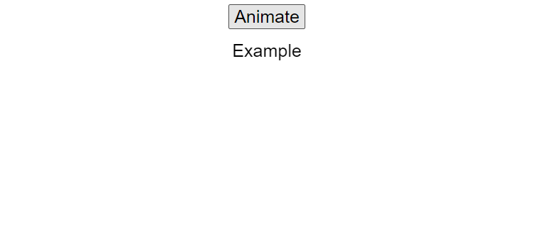
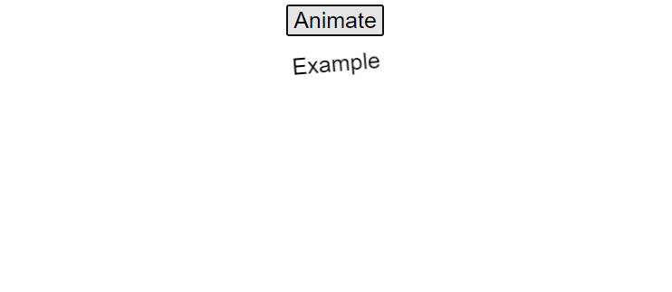
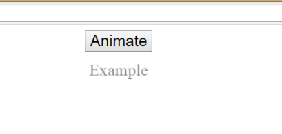
The above code applies two animations. An enter-active-class equals “animated swing” and another leave-active-class equals “animated bounceIn”.We use custom animation classes to apply the animation from the third-party library.
Explicit Transition Duration
We can apply transitions and animations to the element using VueJS. Vue waits for the transionend and animationend events to determine whether animation or transition has ended.
Transitions can sometimes cause delays. When this occurs, we can apply the duration explicitly.
<transition :duration = "1000"></transition>
<transition :duration = "{ enter: 500, leave: 800 }">...</transition>
As shown above, we can use the duration property with a : on the transition element. As shown in the code above, if it is necessary to specify the duration separately for entering and leaving, that can be done.
JavaScript Hooks
Transition classes can be invoked using JavaScript events. Let us consider an example for better understanding.
Example:

<html>
   <head>
      <title>VueJs Instance</title>
      <script type = "text/javascript" src = "js/vue.js"></script>
   </head>
   <body>
      <script src = "https://cdnjs.cloudflare.com/ajax/libs/velocity/1.2.3/velocity.min.js"></script>
      <div id = "example-4">
         <button @click = "show = !show">
            <span style = "font-size:25px;">Toggle</span>
         </button>
         <transition  v-on:before-enter = "beforeEnter"
            v-on:enter = "enter"
            v-on:leave = "leave"
            v-bind:css = "false">
            <p v-if = "show" style = "font-size:25px;">Animation Example with velocity</p>
         </transition>
      </div>
      <script type = "text/javascript">
         var vm = new Vue({
            el: '#example-4',
            data: {
               show: false
            },
            methods: {
               beforeEnter: function (el) {
                  el.style.opacity = 0
               },
               enter: function (el, done) {
                  Velocity(el, { opacity: 1, fontSize: '25px' }, { duration: 1000 })
                  Velocity(el, { fontSize: '10px' }, { complete: done })
               },
               leave: function (el, done) {
                  Velocity(el, { translateX: '15px', rotateZ: '50deg' }, { duration: 1500 })
                  Velocity(el, { rotateZ: '100deg' }, { loop: 2 })
                  Velocity(el, {
                     rotateZ: '45deg',
                     translateY: '30px',
                     translateX: '30px',
                     opacity: 0
                  }, { complete: done })
               }
            }
         });
      </script>
   </body>
</html>
Output: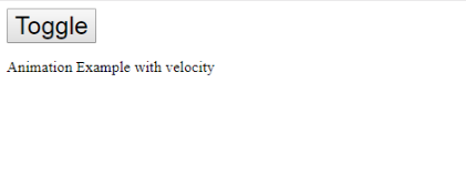
The above example uses js methods to perform animation on the transition element.
The transition methods are as follows: −
<transition  v-on:before-enter = "beforeEnter"
   v-on:enter = "enter"
   v-on:leave = "leave"
   v-bind:css = "false">
   <p v-if = "show" style = "font-size:25px;">Animation Example with velocity</p>
</transition>
v-on and the name of the event are added as prefixes. The following methods are defined in the Vue instance: −
methods: {
   beforeEnter: function (el) {
      el.style.opacity = 0
   },
   enter: function (el, done) {
      Velocity(el, { opacity: 1, fontSize: '25px' }, { duration: 1000 })
      Velocity(el, { fontSize: '10px' }, { complete: done })
   },
   leave: function (el, done) {
      Velocity(el, { translateX: '15px', rotateZ: '50deg' }, { duration: 1500 })
      Velocity(el, { rotateZ: '100deg' }, { loop: 2 })
      Velocity(el, {
         rotateZ: '45deg',
         translateY: '30px',
         translateX: '30px',
         opacity: 0
      }, { complete: done })
   }
}
Each of these methods applies the required transition. There is an opacity animation applied upon clicking the button as well as when the animation is complete. An external library is used for the animation.
This is done so that Vue understands it is a JavaScript transition by adding the property v-bind:css = “false”.
Transition at the Initial Render
To add animation at the start, we need to add the ‘appear’ property to the transition element.
Let’s look at an example to understand it better.
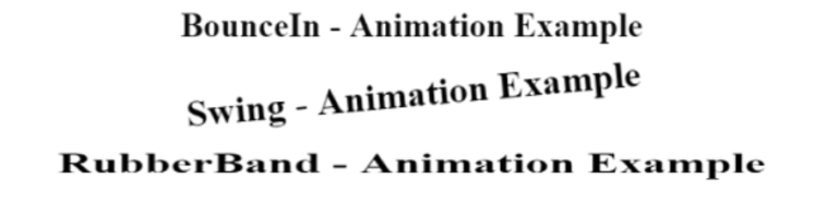
Example:

<html>
   <head>
      <link href = "https://cdn.jsdelivr.net/npm/[email protected]" rel = "stylesheet" type = "text/css">
      <script type = "text/javascript" src = "js/vue.js"></script>
   </head>
   <body>
      <div id = "animate" style = "text-align:center">
         <transition
            appear
            appear-class = "custom-appear-class"
            appear-active-class = "animated bounceIn">
            <h1>BounceIn - Animation Example</h1>
         </transition>
         <transition
            appear
            appear-class = "custom-appear-class"
            appear-active-class = "animated swing">
            <h1>Swing - Animation Example</h1>
         </transition>
         <transition
            appear
            appear-class = "custom-appear-class"
            appear-active-class = "animated rubberBand">
            <h1>RubberBand - Animation Example</h1>
         </transition>
      </div>
      <script type = "text/javascript">
         var vm =  new Vue({
            el: '#animate',
            data: {
               show: true
            }
         });
      </script>
   </body>
</html>
In the above example, we have used three different animations from the animate.css library. For the transition element, we have added an appear property.On execution of the above code, the following will be the output in the browser.
Animation on Components
Using the following code, we can wrap the transition for the components. Here we have used a dynamic component.
Example:

<html>
   <head>
      <title>VueJs Instance</title>
      <script type = "text/javascript" src = "js/vue.js"></script>
      <link href = "https://cdn.jsdelivr.net/npm/[email protected]" rel = "stylesheet" type = "text/css">
   </head>
   <body>
      <div id = "databinding" style = "text-align:center;">
         <transition  appear
            appear-class = "custom-appear-class"
            appear-active-class = "animated wobble">
            <component v-bind:is = "view"></component>
         </transition>
      </div>
      <script type = "text/javascript">
         var vm = new Vue({
            el: '#databinding',
            data: {
               view: 'component1'
            },
            components: {
               'component1': {
                  template: '<div><span style = "font-
                  size:25;color:red;">Animation on Components</span></div>'
               }
            }
         });
      </script>
   </body>
</html>
Output:

2. Directives
A directive tells VueJS how to do something. We have already seen directives like v-if, v-show, v-else, v-for, v-bind, v-model, v-on, etc.
As with components, we will create global directives.
Syntax

Vue.directive('nameofthedirective', {
  bind(e1, binding, vnode) {
   }
})
We must create a directive using Vue.directive. As shown above, it takes the name of the directive. Consider an example to illustrate how directives work.
Example:
<html>
<head>
<title>VueJs Instance</title>
<script type = "text/javascript" src = "js/vue.js"></script>
</head>
<body>
<div id = "databinding">
<div v-changestyle>VueJS Directive</div>
</div>
<script type = "text/javascript">
Vue.directive("changestyle",{
bind(e1,binding, vnode) {
console.log(e1);
e1.style.color = "red";
e1.style.fontSize = "30px";
}
});
var vm = new Vue({
el: '#databinding',
data: {
},
methods : {
},
});
</script>
</body>
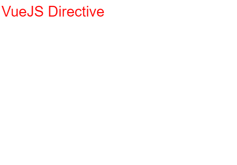
</html>In this example, we have created a custom directive changestyle, as shown below.
Vue.directive("changestyle",{
   bind(e1,binding, vnode) {
      console.log(e1);
      e1.style.color = "red";
      e1.style.fontSize = "30px";
   }
});
We are assigning the following changestyle to a div.
<div v-changestyle>VueJS Directive</div>
This will display the text VueJs Directive in red color and 30px font size in the browser.
Output:
A part of the directive is the bind method. This function takes three arguments e1, the element to which the custom directive needs to be applied. A binding is like an argument passed to the custom directive, e.g. v-changestyle = ‘[color:’green’]’, where green is read from the binding argument and vnode is the node name.
As we can see in the next example, we consoled all the arguments and it shows what details each one gives.
Here is an example of a value passed to the custom directive.
<html>
   <head>
      <title>VueJs Instance</title>
      <script type = "text/javascript" src = "js/vue.js"></script>
   </head>
   <body>
      <div id = "databinding">
         <div v-changestyle = "{color:'green'}">VueJS Directive</div>
      </div>
      <script type = "text/javascript">
         Vue.directive("changestyle",{
            bind(e1,binding, vnode) {
               console.log(e1);
               console.log(binding.value.color);
               console.log(vnode);
               e1.style.color=binding.value.color;
               e1.style.fontSize = "30px";
            }
         });
         var vm = new Vue({
            el: '#databinding',
            data: {
            },
            methods : {
            },
         });
      </script>
   </body>
</html>
Output:
Green is the new color of the text. This value is passed using the following code.
<div v-changestyle = "{color:'green'}">VueJS Directive</div>And it is accessed using the following piece of code.
Vue.directive("changestyle",{

   bind(e1,binding, vnode) {

      console.log(e1);

      console.log(binding.value.color);

      console.log(vnode);

      e1.style.color=binding.value.color;

      e1.style.fontSize = "30px";

   }

});
Filters
There are filters in VueJS that help format text.In addition to v-bind and interpolation ({{}}), it is used. For filters, we need a pipe symbol at the end of the expression.
Example:
<html>
<head>
<title>VueJs Instance</title>
<script type = "text/javascript" src = "js/vue.js"></script>
</head>
<body>
<div id = "databinding">
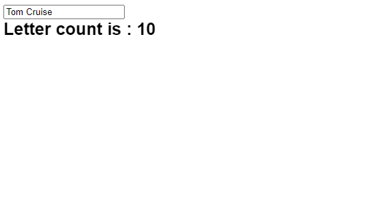
<input v-model = "name" placeholder = "Enter Name" /><br/>
<span style = "font-size:25px;"><b>Letter count is : {{name | countletters}}</b></span>
</div>
<script type = "text/javascript">
var vm = new Vue({
el: '#databinding',
data: {
name : ""
},
filters : {
countletters : function(value) {
return value.length;
}
}
});
</script>
</body>
</html>Using the above example, we have created a simple filter called countletters. The Countletters filter counts the number of characters entered in the text box. The following piece of code uses the filter property and defines the filter used to make use of filters.
filters : {
   countletters : function(value) {
      return value.length;
   }
}
We are defining the method countletters and returning the length of the entered string.
To use the filter in the display, we have used the pipe operator and the filter name, countletters.
<span style = "font-size:25px;"><b>Letter count is : {{name | countletters}}</b></span>Following is the display in the browser.
Using the following code, we can also pass arguments to the filter.
<span style = "font-size:25px;"><b>Letter count is : {{name | countletters('a1', 'a2')}}</b></span>The countletters will now have three parameters, i.e. message, a1, and a2.
By using the following code, we can pass multiple filters to the interpolation.
<span style = "font-size:25px;"><b>Letter count is : {{name | countlettersA, countlettersB}}</b></span>Two methods are defined in the filter property, countlettersA and countlettersB, and countlettersA passes the details to countlettersB.
3. Routing
The router feature in VueJS is not built-in. We’ll need to install it separately.
Direct Download from CDN
The latest version of vue-router can be found at https://unpkg.com/vue-router/dist/vue-router.js
Unpkg.com provides npm-based cdn links. The above link is always updated to the recent version. We can download and host it, and use it with a script tag along with vue.js as follows −
<script src = "/path/to/vue.js"></script>
<script src = "/path/to/vue-router.js"></script>
Using NPM
Install the vue-router by running the following command.
npm install vue-router
Using GitHub
As shown below, we can clone the repository from GitHub
git clone https://github.com/vuejs/vue-router.git node_modules/vue-router
cd node_modules/vue-router
npm install
npm run build
Let’s look at a simple example using vue-router.js.
Example:
<html>
<head>
<title>VueJs Instance</title>
<script type = "text/javascript" src = "js/vue.js"></script>
<script type = "text/javascript" src = "js/vue-router.js"></script>
</head>
<body>
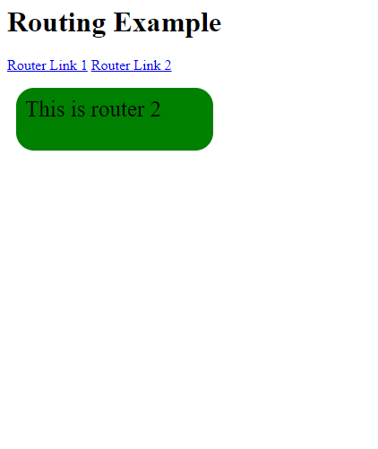
<div id = "app">
<h1>Routing Example</h1>
<p>
<router-link to = "/route1">Router Link 1</router-link>
<router-link to = "/route2">Router Link 2</router-link>
</p>
<!-- route outlet -->
<!-- component matched by the route will render here -->
<router-view></router-view>
</div>
<script type = "text/javascript">
const Route1 = { template: '<div style = "border-radius:20px;background-color:cyan;width:200px;height:50px;margin:10px;font-size:25px;padding:10px;">This is router 1</div>' }
const Route2 = { template: '<div style = "border-radius:20px;background-color:green;width:200px;height:50px;margin:10px;font-size:25px;padding:10px;">This is router 2</div>' }
const routes = [
{ path: '/route1', component: Route1 },
{ path: '/route2', component: Route2 }
];
const router = new VueRouter({
routes // short for `routes: routes`
});
var vm = new Vue({
el: '#app',
router
});
</script>
</body>
</html>Output: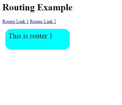
We need to add the vue-router.js file before we can start routing. Save the code from https://unpkg.com/vue-router/dist/vue-router.js in the file vue-router.js.
The script is added after vue.js as follows −
<script type = "text/javascript" src = "js/vue.js"></script>
<script type = "text/javascript" src = "js/vue-router.js"></script>
The body section has a router link defined as follows:
<p>
   <router-link   to = "/route1">Router Link 1</router-link>
   <router-link    to = "/route2">Router Link 2</router-link>
</p>
<router-link> is a component that is used to navigate to HTML content. To represents the destination, i.e. the source file from which the contents to be displayed will be taken.
The code above creates two router links.
You can find the initialization of the router in the script section. The two constants are as follows: −
const  Route1 = { template: '<div style = "border-radius:20px;background-color:cyan;width:200px;height:50px;margin:10px;font-size:25px;padding:10px;">This is router 1</div>' };
const Route2 = { template: '<div style = "border-radius:20px;background-color:green;width:200px;height:50px;margin:10px;font-size:25px;padding:10px;">This is router 2</div>' }
When the router link is clicked, they need to show templates.
The next section is the route declaration, which defines the path to be displayed in the URL.
const routes = [
   { path: '/route1', component: Route1 },
   { path: '/route2', component: Route2 }
];
The route defines the path and the component. The path i.e. /route1 will be displayed in the URL when the user clicks on the router link.
The component takes the names of the templates to display. The path from the routes to the property needs to match the router link.
For example, <router-link to = ”path here”></router-link>
The following code creates an instance of VueRouter.
const router = new VueRouter({
   routes // short for `routes: routes`
});
VueRouter constructor takes routes as parameters. Using the following piece of code, we assign the router object to the main vue instance.
var vm = new Vue({
el: '#app',
router
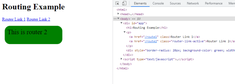
});View the display in the browser by executing the example. We can see from the following screenshot that the router link adds class to the active element.
Inspecting and checking the router link, we find that it adds class to the active element, as shown in the following screenshot.
Props for Router Link
Here are a few more properties to pass to .to
It represents the destination path of the . The value of to will be passed internally to router.push() when clicked. The value must be a string or a location object. Binding an object as shown in e.g. 2 is necessary when using it.Example 1: Router Link 1 renders as <a href = ”#/route”>Router Link </a>
Example 2:
<router-link v-bind:to = "{path:'/route1'}">Router Link 1</router-link>
Example 3:
"{path:'/route1', query: { name: 'Rock' }}">Router Link 1//router link with query string.Following is the output of Example 3.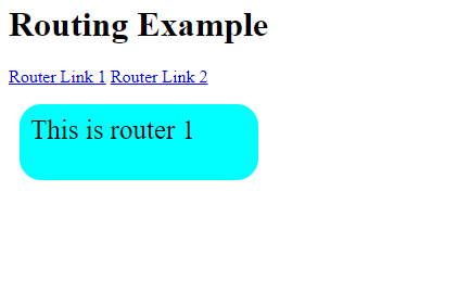
replace
Replacing the router link with replace will cause it to call router.replace() instead of router.push(). Replace will not store the navigation history.Example
<router-link v-bind:to = "{path:'/route1', query: { name: 'Rock' }}" replace>Router Link 1</router-link>append
When appended to the <router-link><router-link>, the path will become relative.If If we want to go from router link /route1 to router link /route2, the path will appear in the browser as /route1/route2.Example
<router-link v-bind:to = "{ path: '/route1'}" append>Router Link 1</router-link>
tag
The current <router-link> renders as a tag. In case we want to render it as another tag, we must specify it using tag = ‘tagname’;Example
<p>
<router-link v-bind:to = "{ path: '/route1'}" tag = "span">Router Link 1</router-link>
<router-link v-bind:to = "{ path: '/route2'}" tag = "span">Router Link 2</router-link>
</p>This is what is displayed in the browser since we specified the tag as span.
active-class
If a router link is active, the active class is router-link-active. The following code shows how to overwrite the class by setting the same.<style>
._active{
background-color : red;
}
</style>
<p>
<router-link v-bind:to = "{ path: '/route1'}" active-class = "_active">Router Link 1</router-link>
<router-link v-bind:to = "{ path: '/route2'}" tag = "span">Router Link 2</router-link>
</p>The class is active_class = “_active”. This is what the browser displays.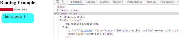
exact-active-class
Router-link-exact-active is the default exactactive class. The exactactive class can be overridden.Example:
<p>
<router-link v-bind:to = "{ path: '/route1'}" exact-active-class = "_active">Router Link 1</router-link>
<router-link v-bind:to = "{ path: '/route2'}" tag = "span">Router Link 2</router-link>
</p>The browser displays this.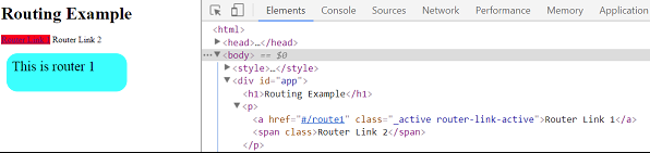
event
Currently, the default event for router-link is click. By changing this property, we can change the event.Example:
<router-link v-bind:to = "{ path: '/route1'}" event = "mouseover">Router Link 1</router-link>Whenever we mouseover the router link, it will navigate in the manner shown in the following browser. Click on Router link 1 to see the navigation change.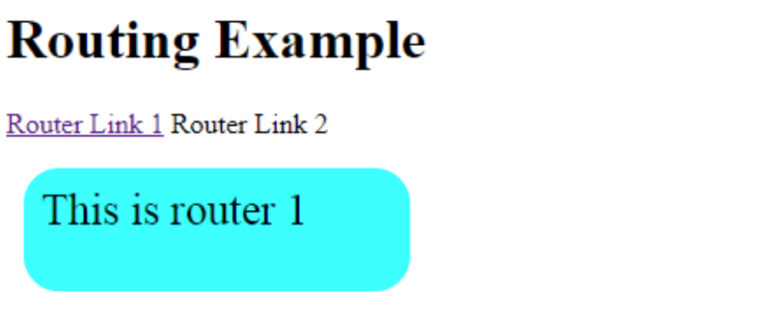
In next section describes, what is Mixins, Render Function and Reactive Interface uses in VueJs with explanations.